


Multichromatics: Robert Ryman and Jennifer Guidi
On a Saturday afternoon in early February, two blue-chip exhibitions left the following impressions.

Robert Ryman: 1961-1964 at David Zwirner—November 9, 2023—February 3, 2024
Many know Ryman for his white squares. So the origin story goes: Ryman was a security guard at MoMA which, by the 1950s, was still a young institution exhibiting work by the barely art world-ordained New York School painters. Oh, to live during those chaotic, creative times! When art could be new and revolutionary and refined to pure ideals by its creators who drank together all night in the same corner bars.
Ryman was not at the bars, of course. He was at the museum, guarding the avant-garde. Perhaps he strolled MoMA’s silent hallways at night, belt and keys jangling on his way from a Newman to a Pollock. Perhaps he thought to himself, “I could do that.” And then—unlike the Upper East Side mom’s four-year-old, whom she always claims can paint like the abstract expressionists—he picked up his brush and did just that: paint, for the next 60 years.

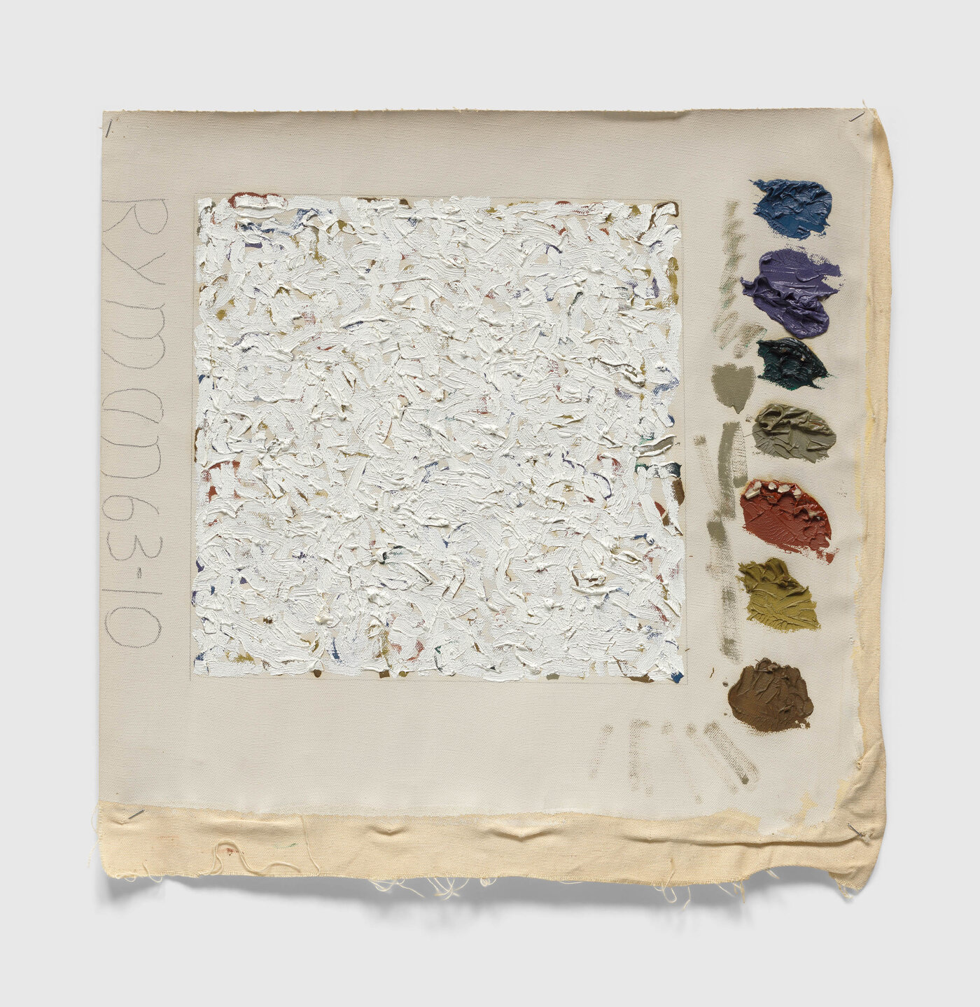
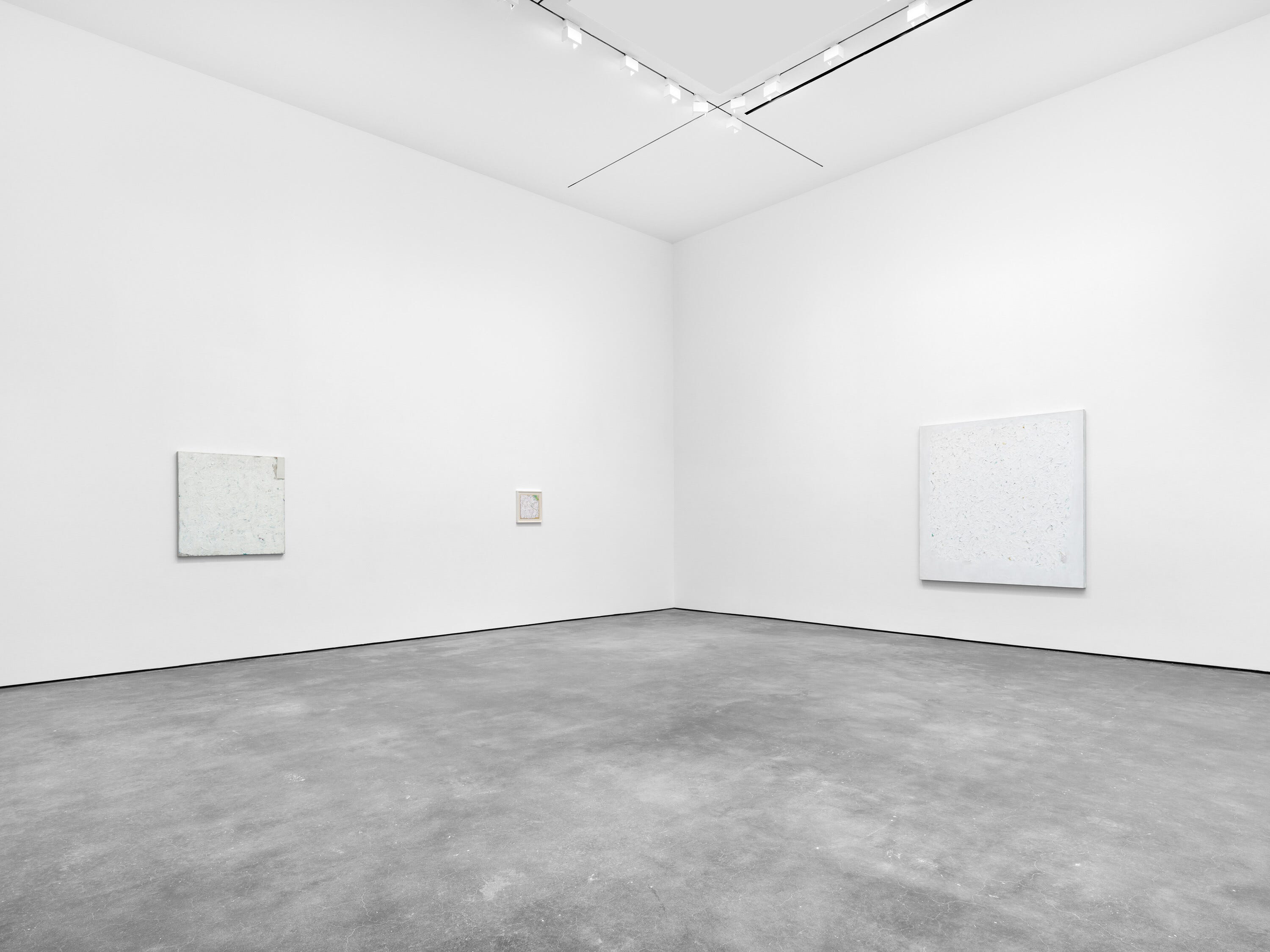
Robert Ryman: 1961-1964 at David Zwiner in New York features the artist’s early forays into a decades-long engagement (obsession?) with white. Except for one painting in the exhibition’s last skylit chamber, in most of the pieces presented, Ryman was still working on canvas. This last room also holds a press photo favorite: a white square on an unstretched canvas alongside a dutifully daubed palette showing the underpainting’s earthen colors. Look! Process! Evidence! “Not monochromatic,” Ryman argued, and so critics love to correct laypeople.
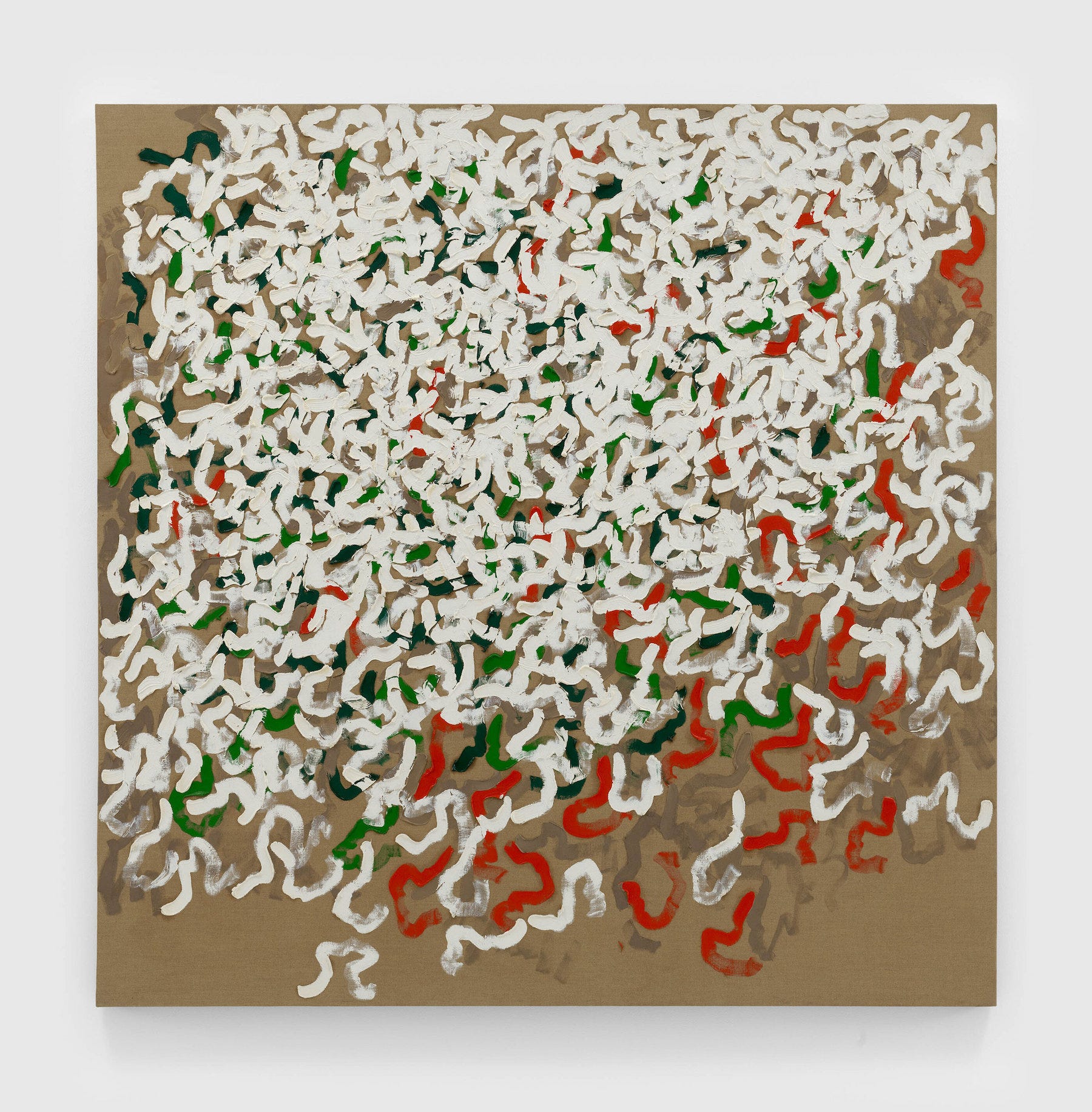
In the exhibition’s first room, these supporting colors are clearly visible. Ryman’s white strokes—like bacterium under a microscope, my friend Peter said—wriggle atop grass greens and lipstick reds.
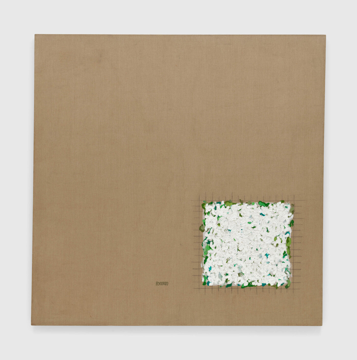
In one canvas, the biological teeming is contained in a small graphite grid at the bottom right quadrant.
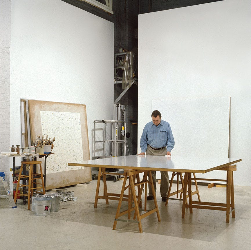
Ryman often plays with these liminal spaces: the borders, his famous squares, delineating painting from wall. In one painting, he’ll emphasize the border with a whitewash. In another, he’ll ignore it and paint right up to the edge. Yet, photographs of his studio reveal that he never broke the sanctity of the two spaces: art object (canvas, metal, what have you) and wall.
I wish the origin story would expand and depict the exact moment Ryman decided to commit to painting. Did an elder artist, a Rothko or so-and-so visiting MoMA, convince him to trade in his security badge for a brush? Or did curator Dorothy Miller strike up a conversation, visit his apartment studio, and see something worthwhile being worked through in white? Ryman’s first institutional exhibition was not at MoMA, but at the Guggenheim in a group show in 1966. It was a meteoric rise from museum staff to exhibiting artist. (One may graduate from the former to the latter, but not hold both titles concurrently, it seems. I can’t help but see the staff shows put on by respected institutions today as a way to keep the moonlighting artists’ work distinctly separate. The Whitney’s 2022 staff show was held not in its hallowed halls, but in a small community gallery nearby. The museum’s mission states, “As the preeminent advocate for American art, we foster the work of living artists at critical moments in their careers.” However, The Whitney and its counterparts across the city avoid publicizing any images of staff exhibition installations, obviating the potential for those career-defining moments. I digress.)
The second room holds my favorite painting.
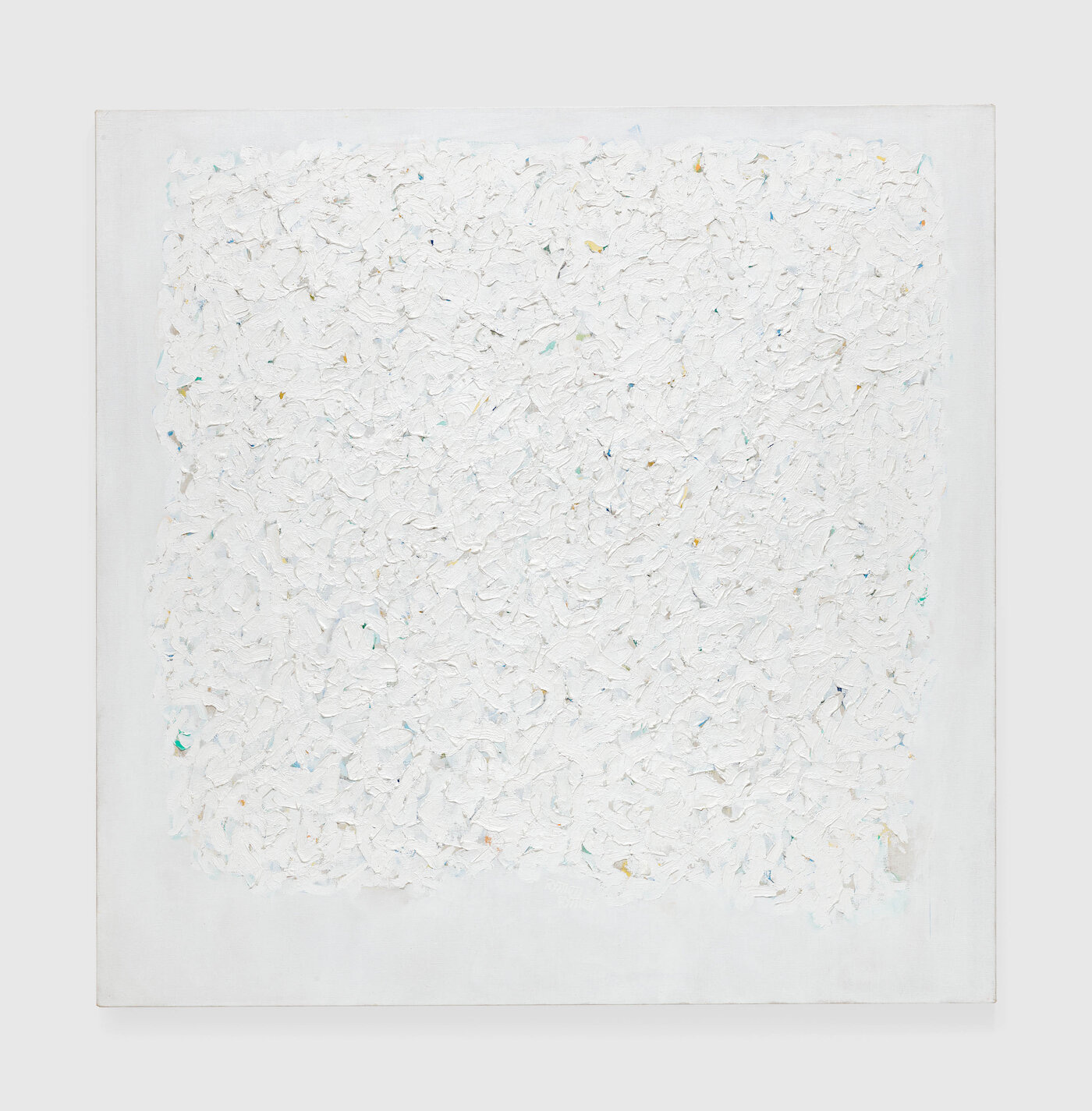
The chromatic assertions visible in other rooms are struggling to breathe in this painting’s frothy white surface.
In addition to claiming his work isn’t monochromatic or minimalist, Ryman also claimed his paintings are “realist.” Not real in the sense of representation, but in the sense that his paintings are exactly what they are—and nothing more. Thomas McEvilley in his brilliant 1992 Artforum essay on Ryman states, “It is completely honest in its physical and material presence, which involves no tricks, puns, or hidden agendas. The painting is called ‘Realist’ because it is simply and directly a real object, referring to nothing outside itself, stating nothing but its own identity.”
McEvilley goes on to raise his critical eyebrow at the likes of Ryman and Frank Stella, (who echoed Ryman’s philosophy with his quote, “what you see is what you get”): “These artists…have not explained why they bothered to make the painting at all, rather than simply pointing to the wall, which is already there and is already ‘exactly what you see.’”
McEvilley did not have the pleasure of touring the exhibition with a real estate developer. Whereas I look at a wall and see color choice—and, well, that’s about it—Peter sees budgets, ordinances, architectural allowances, hidden insulation and electrical wires: a million choices and potential complications undergirding the presentation of a clean, white wall.
Indeed, into the very wall itself, Ryman pulls you in. You find yourself leaning forward and into the vibrational space he creates with his all-over white, where your eyes can’t quite fixate on any one point. In these paintings, I seem to be looking at a microscope view superimposed onto the thing it is magnifying. Ryman’s square could be a study of drywall fibers coated with paint, microscopic flecks of other pigments contaminating the white, texture revealing scars of prior spackling and sanding.
Closely examined and framed in this way, we may deduce that any apparently white surface—white square, blank expanse, seemingly empty space—means we aren’t looking hard enough.
Rituals, Jennifer Guidi at Gagosian—January 17–March 2, 2024
Where Ryman’s paintings have barely perceptible color, Jennifer Guidi’s paintings in Rituals have all of the colors. Like “all of the feels,” Gagosian’s presentation can only make sense in the internet age. I begin, again, in the last room, where the wall is painted millennial- pandering-pink. Here, a large green canvas evokes moss and lichen plucked from a forest floor.

This piece and every other painting in the show feature a signature element: a point on each canvas’s upper left quadrant from which dashes radiate in expanding rings. “If you were a viewer looking into a mirror, that central point would reflect your heart center,” Guidi says in a profile in Gagosian Quarterly.
In most of her paintings, the dashes are pushed into the paint-sand mixture. The substrate is moved, not removed, which produces a gouge with a crowning swell of displaced sand.
The exhibition’s first triptych trains your eye to recognize the pattern right away. A bright ROYGBIV spectrum flares out from each heart node. Because the colors are identical across the panels, it is Guidi’s treatment of the divets that highlights their persistence throughout the show. In the rightmost panel, the little sand hill at the top of each dash is painted black, like a French manicured tip. In the central painting, the groove itself gets the black paint. The leftmost panel is the center panel’s inverse—the surrounding ground is darkened around the dashes.

Guidi’s canvases make for fun yet unchallenging viewing. Psychedelic, hotly chromatic landscapes and abstract paintings invite all manner of associations. Of course, she’s a California painter; how could she not be with those mountains and skies? Of course, she paints to hip-hop music; how could she not with those bold colors. (Find the Gagosian-curated playlist on Spotify). Of course, she references Tibetan sand mandalas; I recognized the meditative, radial pattern. Guidi’s work evokes a kind of aesthetically supported spirituality. I imagine a Burning Man-loving, meditation-touting tech bro having the “I-wants” in this show.
On my way out, before I can be any more dismissive, I spot the vibration.
It’s the same energy Ryman created in his froths and waves of white, here in a vertical panel that could be entirely abstract or could depict, simply, the sun.
A hot yellow center moves into fiery orange and red before dimming to a deep ember. You know the next ring would be fully extinguished, a solar flare dissipating into space. Seen from a distance, the background is an inky black but, up close, a Monet-like hatching of purples and teals appears.

The adjacent painting beckons with a loud, confetti-strewn sky, but it’s easy enough to ignore.
Standing in front of the sun painting, I feel calm, like my heartbeat is attuning to its pulse. In front of this piece, I could linger.